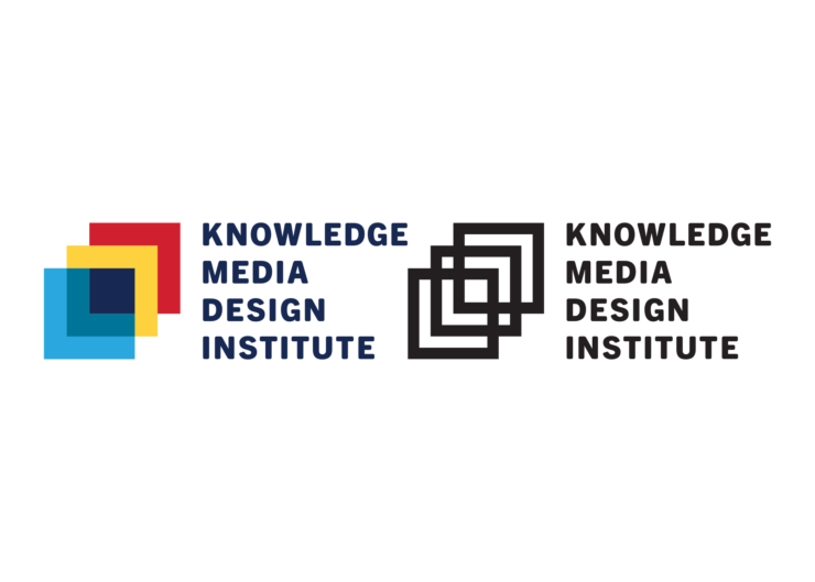
KMDI announced it’s new logo in 2021. The new logo emphasizes themes of interdisciplinary collaboration, discovery, growth, and innovation. Drawing inspiration from the Semaphore flag, pixels, children’s building blocks, and interface design, this new logo uses three rising squares that overlap to graphically represent KMDI’s intersecting domains: Knowledge, Media, and Design.
The squares create a sense of motion and suggest that we assemble knowledge through doing. The new design borrows the red and yellow from Semaphore’s original logo. Selected shades of primary colours were chosen to communicate a sense of play, diversity, and joy. At the center of the new logo is a small square set in U of T’s official blue which anchors KMDI’s identity within the larger institutional community.
This set of seven colours (Teal, Dark Blue, Light Blue, Red, Yellow, Green, Pink) combines a number of U of T’s official swatches and takes inspiration from Semaphore’s historical use of red and yellow. These colours in combination can be used across communication platforms and in the branding of all KMDI projects and marketing. The colour set chosen is playful, contemporary, diverse, joyous, mature, sophisticated.


